Kipper Color
Are you familiar with the children’s show Kipper? My granddaughter simply loves it. It’s easy to see why. Kipper’s world is gentle yet exciting. Recently while she was watching an episode, I noticed how beautifully the artists use color in this show. Many children’s shows have wonderful palettes, but Kipper is one of the most artistic and inspiring. There are beautiful greens of trees, grass, lily pads, and blues in all sorts of hues and varying saturation. One of the most impressive uses of color I have seen on the show is the use of greys and browns. They fade in and out and create movement as well as places of stillness. The designers and artists use space and color brilliantly. In some scenes the background is rather minimal-a green line with faded out edges gives you the sense of ground. In other scenes, the background is wonderfully full with mixtures of bright and more subtle color. No wonder the atmosphere is so calm and stable on that show, even when the characters are experiencing some rather exciting adventures.
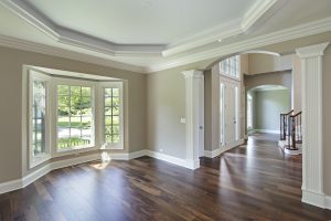
You can do the same in your home. Picture classic grey walls with pops of blue, red or green, or you could paint the walls in one of the modern shades of tan with green, grey, blue or red pops of color. The color pops can be provided by furniture, flowers, picture frames, you name it. The possibilities are endless. You can truly find color inspiration anywhere. Take a quick look at the following clips to see how the artists use color to influence the mood of the show. Think about what kind of mood you want to have in the rooms of your home and follow your instincts and what makes you happy.
You can find the links here (This 7 minute episode has gorgeous displays of color in the objects the characters touch as well as the backgrounds; be sure to note how they blend and contrast with each other) and here.
Enjoy,
Bill


