


Rev Up Your Dining Room with Red!
We are at the beginning of a dining room renaissance. Kitchens have been the heart of the home for centuries. It is where you eat, relax, prepare meals, craft and even work. However, after several years of this informal, multi-purpose eating arrangement, our clients are enjoying one of the most overlooked rooms in a home – the dining room. As it makes a comeback, our clients have to consider what hues are best for that particular space. Color impacts your emotions, levels of concentration, and even your appetite. The psychology of color is especially relevant for your dining room. Therefore, it is important to choose dining room colors that whet the appetite for good food, company and conversation. Save your blues, greens, and pinks for areas where you retreat to relax and unwind or for spaces where you want to stimulate your creativity and enhance your focus. Blues and greens decrease appetite, while reds and yellows increase it. This is why you see restaurants choosing variations of red for their décor; they want you to purchase lots of food. There is also the hope that the red hues will impart a sense of luxury and enhance your perception of the taste and quality of your meal.
We love several luxuriant reds from Benjamin Moore. One of our favorite reds is the appropriately named, Dinner Party (AF-300). Dinner Party is a deeply rich and dramatic color. Its boldness is sure to spark conversation with friends and family as well as stimulate everyone’s appetite. A new and unexpected, but immensely popular dining room color, is purple. Purples that fall on the warm side of the color wheel usually work best. Benjamin Moore’s Kalamata (AF-630) brings an opulent and vibrant quality to any dining room. It was, after all, the color of the Caesars. Purple also reminds us of plump, ripe plums, juicy grapes, and of course wine, which makes it an exceptional color for your dining room.
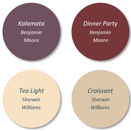
If reds and purples are too much of a statement, you can still take advantage of these warm, appetizing colors by trying a less saturated hue in the orange or yellow families. Tea Light (SW 7681) from Sherwin Williams, will give your dining room a warm and toasty feel. This color also brightens your space with its subtle luminosity. Croissant (SW 7716) tends to lean a bit towards beige, but is still an inviting and warm choice for your dining room. This color will transform your dining room into a relaxing and welcoming space to enjoy meals and family traditions. Both colors work beautifully with various dining room furniture finishes. Cherry, ash, hard maple, red oak and hickory wood finishes graciously compliment Tea Light and Croissant. Each color is a fabulous choice for any dining room.
Whether you prefer the bold Dinner Party or the more subtle Tea Light or if you have questions about other color options, give Christine a call at 508 740-6212 to make an appointment for a color consultation. We will help you explore the various color palettes and choose the color that will make your dining room shine!
Be well,
Bill