


Benjamin Moore’s Neutral Palette
In the past, neutral color palettes were seen as boring and predictable. However, these quiet hues are actually color design gems. Their reputation as dull, bland, work-horses is outdated and unfair. Neutral does not mean boring. Neutral also doesn’t mean 1980’s style beige. Paint manufacturers have updated their beige hues so that they look and feel more modern. It’s also important to note that white and gray colors are also included in the neutral palette family.
Benjamin Moore manufactures a beautiful array of modern neutrals such as Shaker Beige, Lenox Tan, Balboa Mist, Pashmina, and Pale Oak. These colors are soothing and exude a relaxed atmosphere. Who doesn’t need to be surrounded by calm these days?
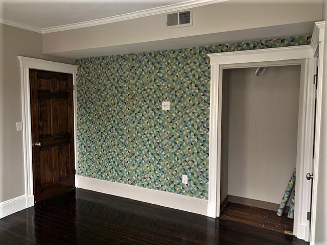
This palette creates a sophisticated background for dynamic lighting and bold accent walls. Our clients chose calming Nimbus from Benjamin Moore as the perfect backdrop for a bold geometric patterned wallcovering.
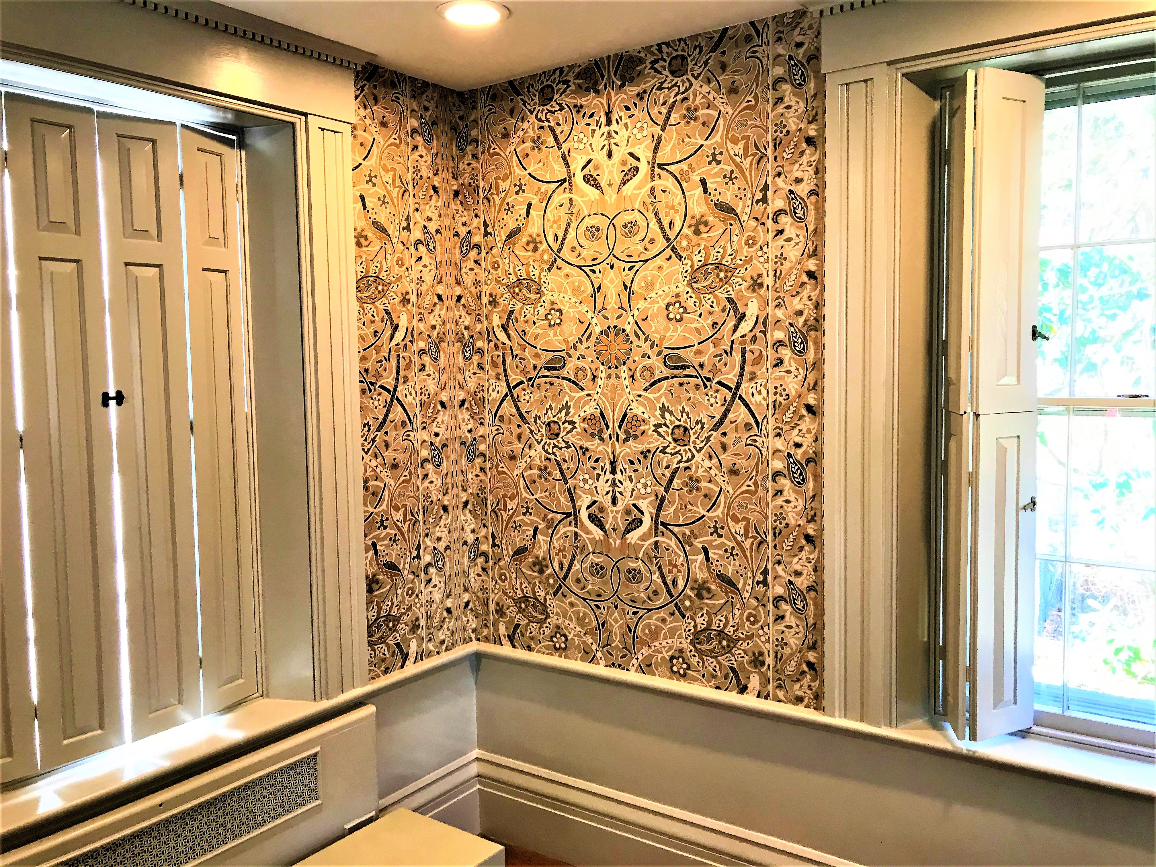
On another project, the owner of a historic home used a gray neutral as the canvas for an eye-catching gold-accented wallcovering. The creative possibilities with neutrals are endless.
Even though these colors aren’t bold splashes, you still need to take care and consider the undertones of the neutral colors you are considering. If you are looking for a warm, familial atmosphere, choose neutrals that have warm undertones. These undertones are red, yellow, and orange. If you wish to create an airy, modernist feel, chose hues with cool undertones like blue, green, and even purple.
Neutrals aren’t meant to be limited to your interior spaces. You can also use these colors for your home’s exterior, sheds, and garages. Neutral palettes are an invitation to expand your color design horizons and creativity. If you are ready to start your color journey, give us a call at 508.740.6212 or click here to get started.