


Subtle Waterfront Style
We recently worked on a beautiful home in Harbor Towers on the Boston waterfront. Our clients wanted to update their home’s palette. The previous color was a toasty kind of beige. The new color is more of a taupe hue, Thunder from Benjamin Moore. Even though there were thousands of colors available, the subtle color our clients wanted was elusive, so we had the color manually adjusted for them. Manual adjustment involves making small, incremental changes to the hue until the subtle color is achieved. The paint technician makes the color lighter or darker. The same color profile is maintained, only the intensity is changed. We painted the central walls of the home with the original strength of the paint color and used the slightly lighter color for the surrounding walls.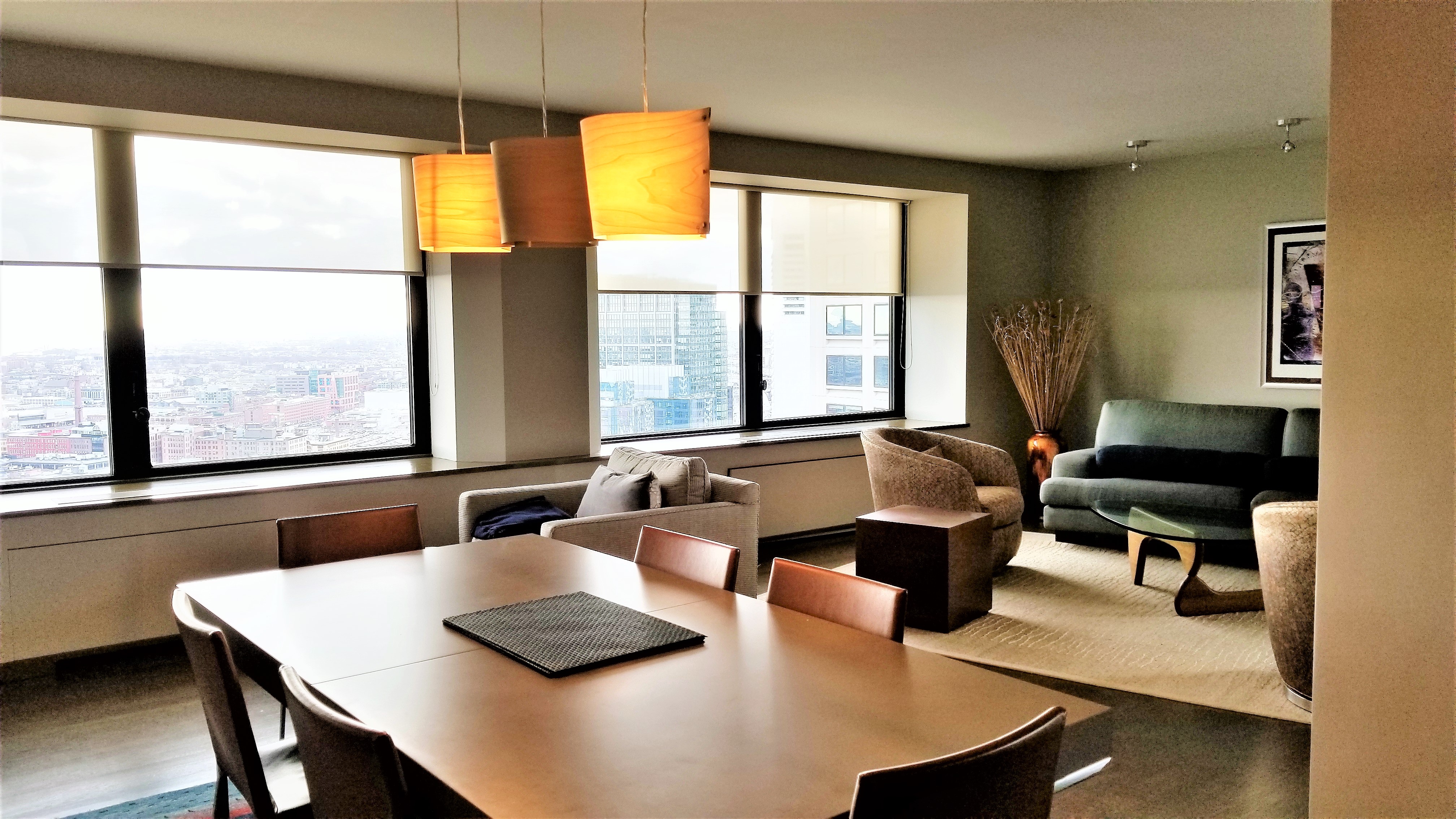
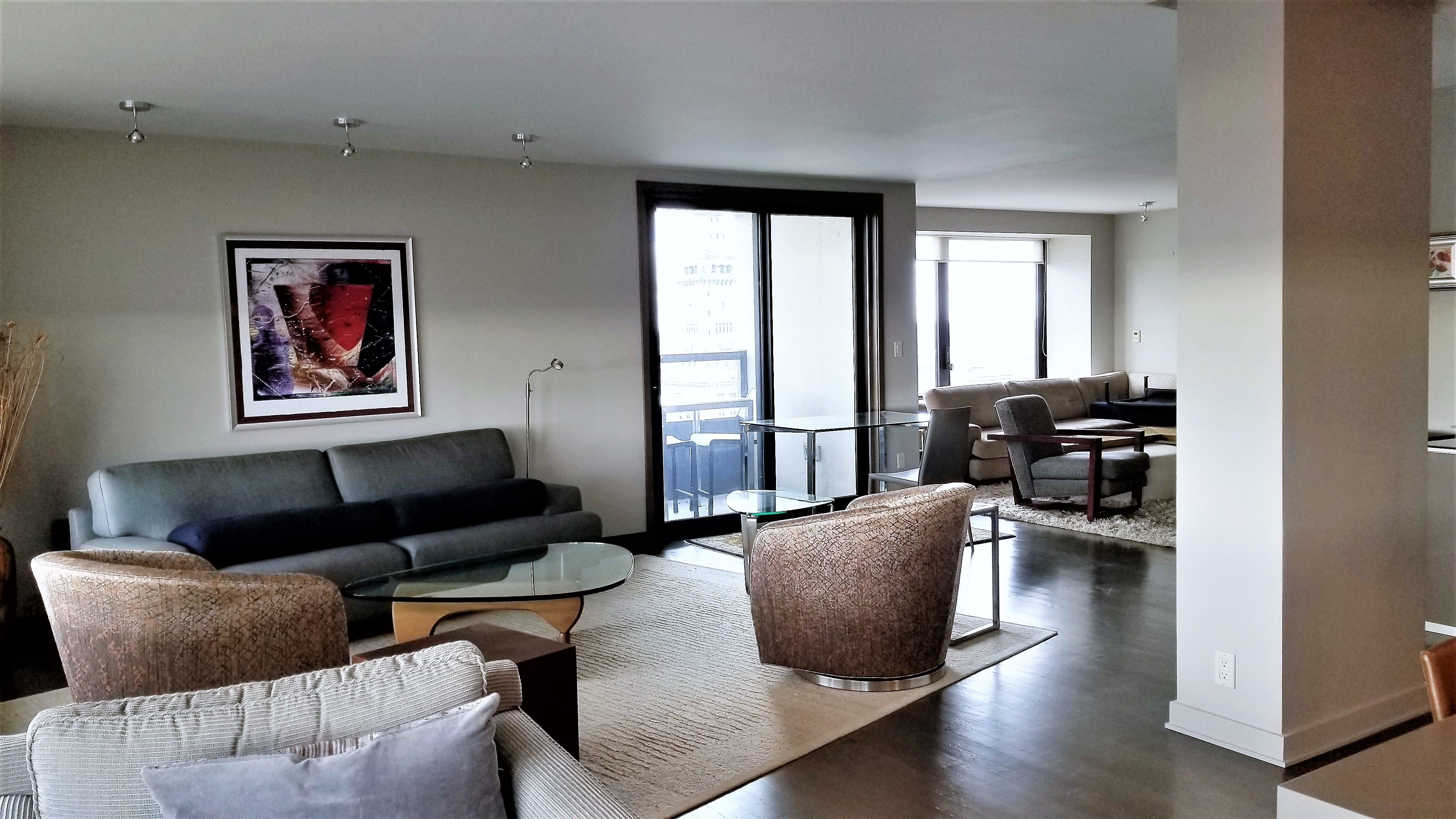
Since it is lighter and grayer than the beige color, it lends an updated and contemporary look to the home. However, our clients did not use light-hued neutrals only. For the accent wall, they chose a dark navy. This color beautifully compliments the warm wood tones of the room. The finish is timeless and tranquil. The unique wood trim of this home accentuates the design. Contemporary design in some spaces calls for bright, white trim. However in this space, the natural wood finish is perfection. Our clients loved the minimal design in this space. This project demonstrates how even a subtle change in color can make an striking difference.
If you have questions about color or if you need help choosing a color for your home, give us a call at 508.740.6212.