Treat Your Home to a Spring Fling!
Spring is a time of renewal. It seems that even our homes are weary and worn after a long winter. Here are two high-impact ways to freshen the look and the feel of your home for spring.
Refurbish Your Home’s Weary Exterior
After several months of being pelted with rain, snow, and sleet, your home’s exterior surfaces could likely use some attention and care. Paint on wooden surfaces can peel from exposure to the elements and from expanding and contracting with the fluctuating temperatures. As the snow drifts recede, the spring season is an opportune time to start planning exterior work. If there were some areas of your home, that looked like they needed repainting before winter, chances are, those exterior areas are now overdue for some repair and maintenance.
Refurbish Your Home’s Outdated Interior
The second high-impact way to revive the look of your home involves simplifying your life, aka clearing the clutter. Clearing out and making room for simplicity is a big trend for 2018. With this new, fresh season, often comes the opportunity for cleaning your home top-to-bottom. Putting documents and pictures in the cloud, being more selective about what we bring into and let stay in our homes, and making more time for the people and events in your life that really matter, help lead you to a simpler life. It’s all connected.
All of these decisions about stuff affect the other choices you make about your surroundings, including the choice to repaint spaces in your home. Getting rid of piles of outgrown clothes and shoes, toys that have not seen the light of day in months if not years, worn out golf clubs and other sports equipment, along with other random items, often reveals tired walls. You may have also outgrown your color choice from years ago. Often spring is a great time to consider regaining a room in your home that has become a catch-all space for extra furniture, unhung artwork or other belongings that don’t seem to have a ‘home’ within your home. Perhaps you have had a proper mourning period for the launch of your freshman college student and it’s time to turn that bedroom into a luxurious guest bedroom, arts and craft studio or a cave for either gender. The decision to paint a room can be the perfect motivation to clear the clutter, and clearing clutter can be the perfect motivation to paint a room.
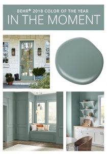
The action of decluttering our homes has a real effect on how you chose to enhance or decorate your newly cleared area. It affects whether you choose paint or wallpaper, bold color or subtle patterns. Industry trends in colors are more purposeful and meaningful now, and there are so many choices and ways to express different aspects of your personality or family style. When a kitchen or powder room needs an effective design, choosing an unapologetically bold color is often just what that space needs. It’s okay to be bold in your design choices. Kitchens and powder rooms are often used for guests and are the perfect places to showcase your striking color choices. Many paint manufacturers chose bold hues for their “2018 Color of the Year.” Caliente from Benjamin Moore and Oceanside from Sherwin Williams are great choices for when you want to make a colorful statement. On the other hand, if subtle is more to your taste or if a dramatic splash of color doesn’t suit your design or home’s personality, the companies have not forgotten you. Consider Behr’s In the Moment, a calming beautiful blue gray. This color was inspired by mindfulness, and will definitely create a peaceful atmosphere in your home.
With Saint Patrick’s Day upon us, we would be remiss to not tell you about a few of our favorite greens. Soft green hues always seem to have a place in a home. We recently used Benjamin Moore’s Light Pistachio in a Needham sunroom (you can see it in the large picture at the beginning of this blog). It was perfect. Lately, we are also loving Pearl Gray from Sherwin Williams. This color has a soft, cool greenish tint when applied to walls. Benjamin Moore’s Silken Pine is a favorite of Bill’s.
If spring is inspiring you and your would like to set up a color consultation, give me a call at 508.640.7212 or fill out our “Let’s Get Started” form here.
Happy Spring!
Christine


