


Posts Tagged ‘color theory’
Treat Your Home to a Spring Fling!
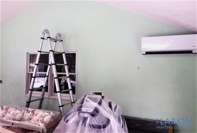
Spring is a time of renewal. It seems that even our homes are weary and worn after a long winter. Here are two high-impact ways to freshen the look and the feel of your home for spring. Refurbish Your Home’s Weary Exterior After several months of being pelted with rain, snow, and sleet, your home’s…
Read MoreTransform Your Wood Finishes!
Do you think it would be impossible to transform the look of your dark-stained trim? Do you worry that the results won’t last or that the dark stain will bleed through the new, lighter finish? Those are not unreasonable concerns. When you first look at a dark finish, change seems unimaginable. It feels like you…
Read MoreRefresh Your Home in 2018 With Defining Colors
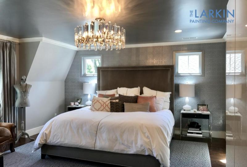
The new year has arrived. Grab your favorite beverage and explore six colors that will take this year’s home décor by storm. Last year was all about gray and other neutral paint colors. Based on customer feedback and current design trends, we think vibrant red, black, dusty rose, metallics, purple and blue will define 2018.…
Read MoreInspire Confidence and Serenity with Navy
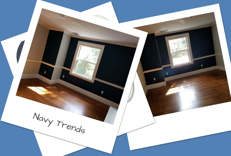
Dramatic navy blue has emerged as an extraordinarily popular color. Named for the dark blue uniforms of the British Royal Navy, this rich, dark blue is on trend. Navy belongs to the “cool” color families, but it can also be used as a neutral. Some hues look more black than blue. Regardless of whether your…
Read MoreBathroom Trends: Elevate Your Style with Wallpaper and Wallcoverings
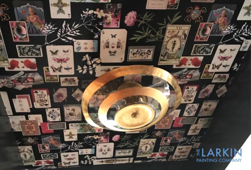
The next great conversation piece is in your bathroom. The new trend is to explore bold and unique wallpaper and wallcovering patterns on bathroom walls. Any bathroom wall is the perfect canvas; kids’, master, guest and powder rooms are the perfect spaces for unique pattern designs that might feel overwhelming in your living room or…
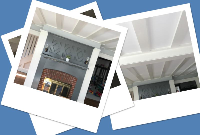
Read MoreSubtle Contrast
Recently the Larkin Painting Company transformed the look of a spectacular hallway in a Beacon Hill home. Beautifully textured wall coverings adorned the hallway walls. We wanted to make sure that the coverings were showcased. We helped our client choose a neutral color palette that complimented this unique design element perfectly. Quite often we use…
Read MoreColor Harmony: The Ping Pong Edition
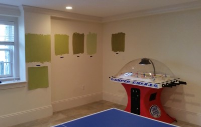
We recently helped our clients use color harmony to transform their neutral-hued basement into a colorful ‘arena’ and gathering place. The family are great fans of ping pong tournaments played between father and son. Unfortunately, the ping pong balls would get lost in play. The cream-colored walls perfectly camouflaged the balls as they sailed…
Read MoreBox of Color: Color Consultation
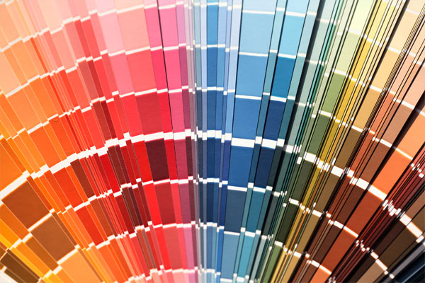
Expert color consultation is one of the quality services we provide for our clients. Recently, we discovered a new color consultation toolkit from Sherwin Williams. It is an all-in-one box of color that we affectionately call “The Suitcase of Fun” because, after all, choosing colors for your home is fun. The Suitcase of Fun includes…
Read MoreThe Edited Palette of Farrow & Ball
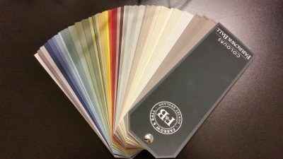
Have you explored colors using an edited palette? A few weeks ago, I attended a beautiful paint and wallcovering event hosted by Farrow & Ball, craftsmen in paint and paper. We use their luxurious products and wanted to learn about their new offerings. Farrow & Ball, an English company, have some higher price points than…
Read More